Over the rainbow
When I started at Skype in 2006, they were moving away from using the Simpsons font (Akbar) to the rainbows and clouds stuff that we're probably best known for.
Skype needed to grow up from the rowdy teenager covered in (rainbow and cloud) tattoos to a more mature person people can depend on (and invest in). Everyone knew us for video calling, but we had other features, so one goal of the redesign was to develop a system to bring those things forward. We had to use stories to show how these features were relevant to everyday life.
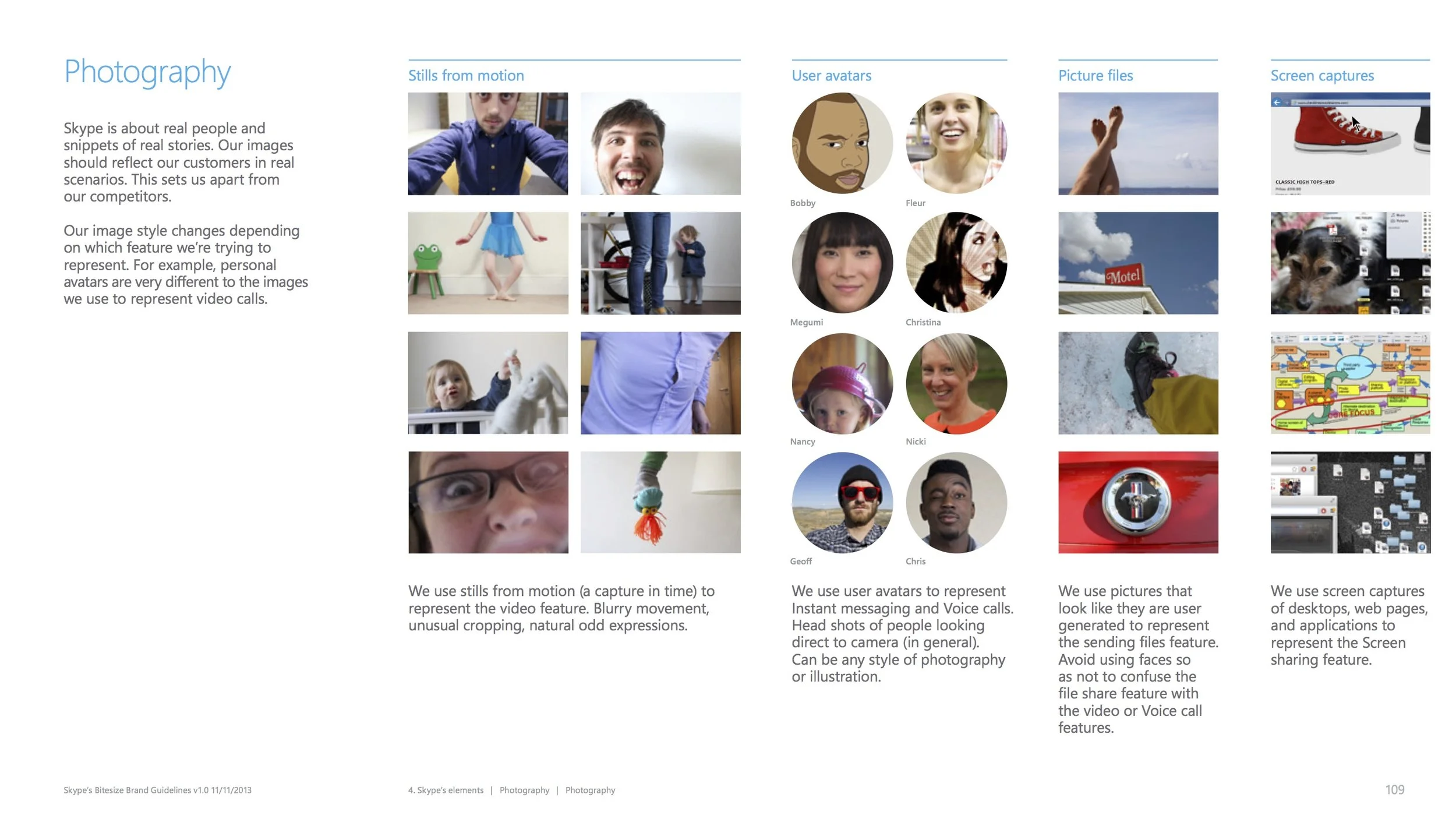
We decided those stories needed three general rules: they needed to feel authentic. Second, they needed to happen every day (not just calling on a holiday). Finally, we wanted to show two or more people doing something together. (A single person on Skype is like having one walkie-talkie.)
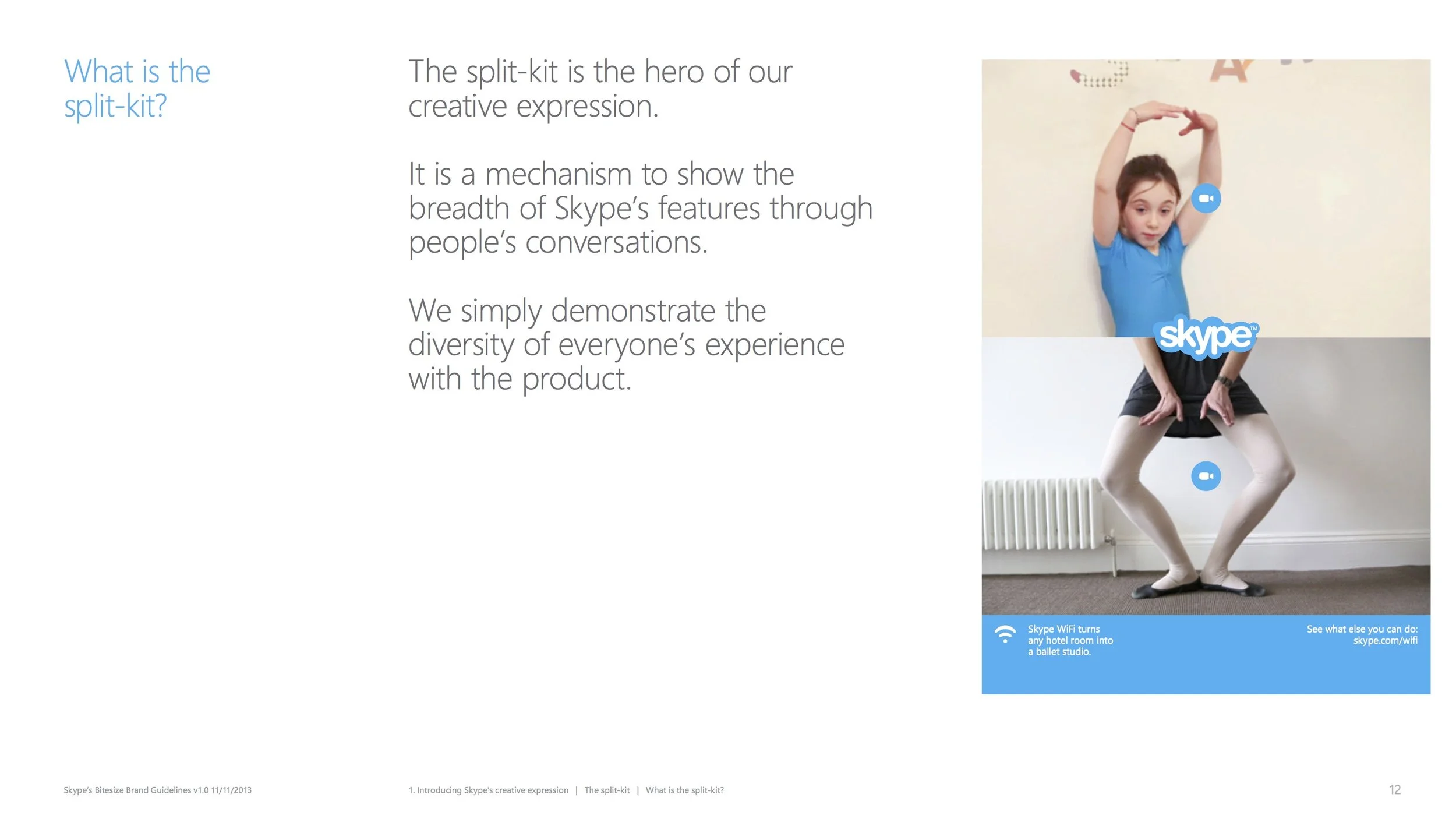
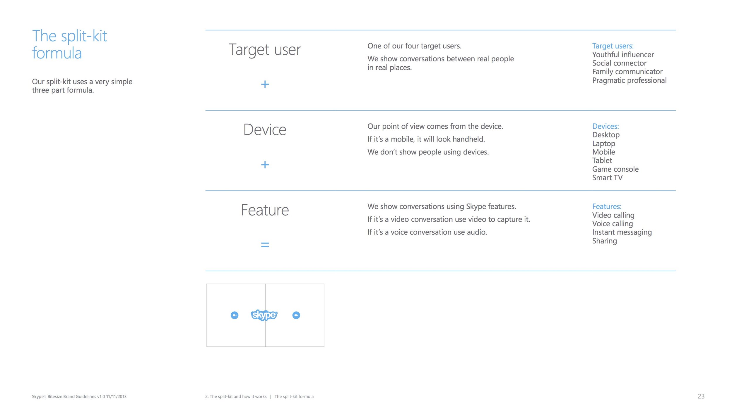
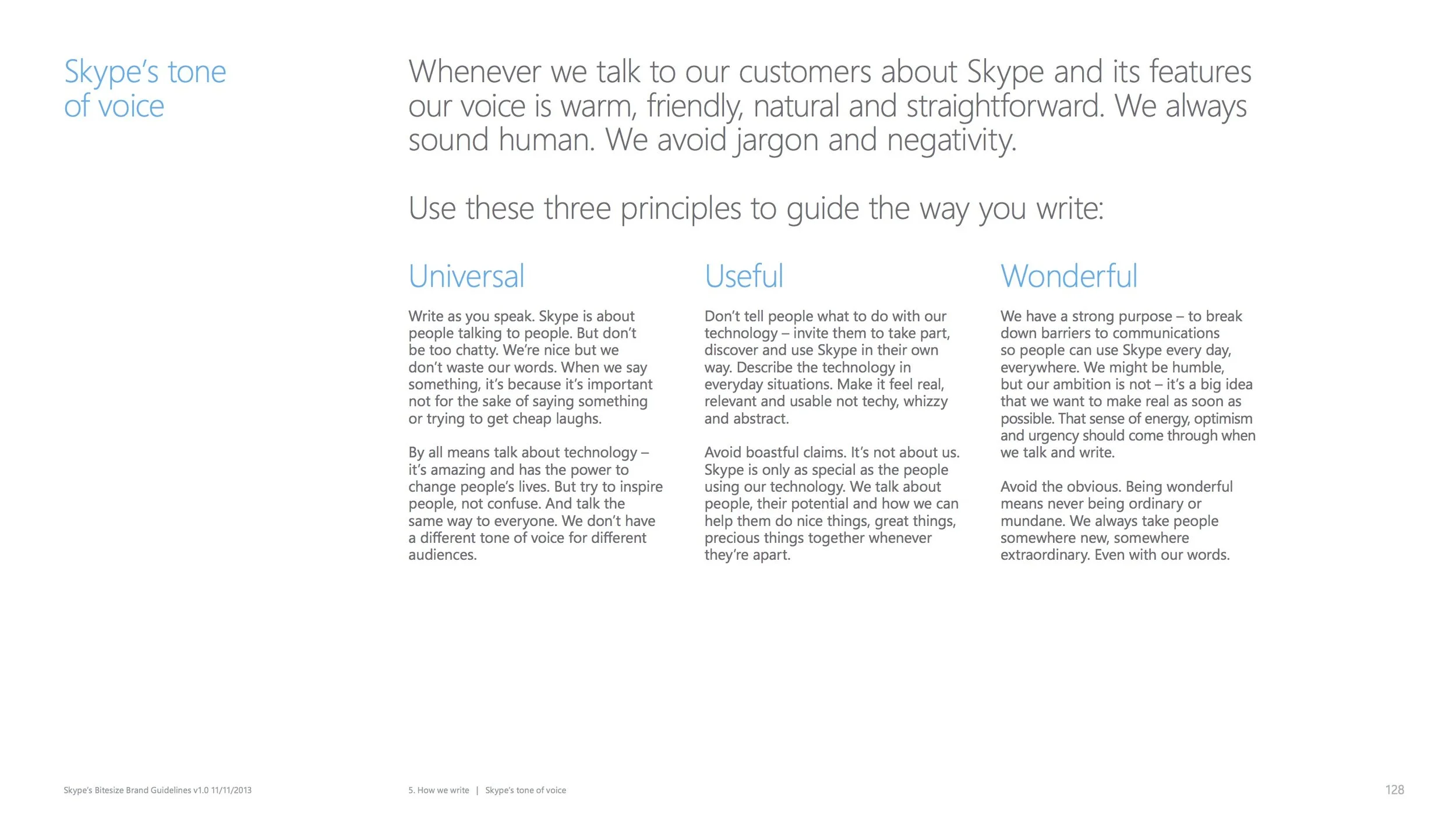
We developed a core set of guidelines for the brand and new design system (that focused around a modular element we called a "split-kit"). We also developed a tone of voice and editorial guidelines. Since we were busy on the social and partner fronts, we specifically developed guidelines for those channels. We onboarded new agencies and employees regularly.


